7 Quality Tools
7 Quality Tools - Making Lean Six Sigma WORK !
The 7 Quality Tools are Problem Solving Tools which can:
- Help to identify and prioritise problems quickly and more effectively.
- Assist the decision making process.
- Provide simple but powerful tools for use in continuous improvement activity.
- Provide a vehicle for communicating problems and resolutions throughout the business.
- Provide a way of extracting information from the data collected.
Planning for Data Collection
- What question do we need to answer?
- How will we recognise and communicate the answers?
- What data analysis tools are we going to use and how to communicate the results?
- What type of data do we need to answer the question?
- Where in the process can we get the data we need, using these 7 quality tools?
- Who in the process can give us the data?
- How can we collect this data from the individuals with minimum effort and error?
- When is the data to be provided?
- How much will it cost to collect the data?
- What additional information do we need for future analysis?
7 Quality Tools Explained
Checksheets
What is a Checksheet?
A simple and effective method of gathering information. Ensures consistency of data collected. Can be completed whilst doing the normal job. Simplifies data collection and analysis. Highlights trends. Spots problems.
How to use Checksheets
Decide on the format required e.g table, tally chart etc. Decide on the factors that need to be measured. Create a format that makes it simple to collect data on all the factors. Allow space for comments – often gives a valuable insight Prepare instructions for use and train the data collectors. Test the checksheet before full usage – allows problems to be eradicated. Audit the process and validate the results.
What is a Pareto Chart?
Commonly known as “ABC analysis” or “the 80:20 rule” For example: 80% of problems are attributed to 20% of the causes Data categories are arranged in order of frequency - starting with the most frequent It is one of the most effective yet simple tools available It identifies the most significant problem to be worked first It is an effective on-going improvement tool This tool distinguishes between the vital few and the trivial many
What is a Scatter Diagram?
A graphical tool allowing the identification of possible relationships between two different sets of variables A display of what happens to one variable when another changes A method of testing possible cause / effect relationships
What is a Histogram?
It has much in common with the Pareto Diagram – can be vertical or horizontal Is a visual way of representing data – easier to display and interpret large amounts of data than using tables It is a picture of the process behaviour at a given process of time
Why use a Histogram?
Allows us to make sense of data It allows us to see patterns that are difficult to see in tables of numbers It is a simple way of communicating data
What is a Control Chart?
It is a statistical tool used to distinguish between variation in a process resulting from common causes, and variation resulting from special causes It is a graphic display of the process stability or instability over time It displays data in the time sequence in which it occurred Why use a Control Chart? Can be used to make judgements of the process performance over a certain period of time It provides a common language for discussing process performance To assess the effectiveness of changes to improve a process
What is a Cause and Effect Diagram?
It is a tool that is used alongside brainstorming and helps to identify, sort and display possible causes of a specific problem. Can otherwise be known as a Fishbone or Ishikawa Diagram. It illustrates the relationship between the outcome and the factors that influence it.
What are Flowcharts?
They show the steps in a process (eg flow of materials, sequence of operations) They can be used to compare intended changes with the actual situation They can be used to initiate process improvement activities Why use Flowcharts?
They provide a process overview at a glance They relate one step in the process to the others They provide insight for data collection and control points They assist in identifying the process customers
Summary
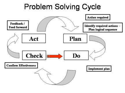
The 7 Quality Tools are used as the basis for Problem Solving. However, it is NOT important just to use any tool, it is important to know HOW and WHEN to use them! 7 Quality Tools


